Introduction
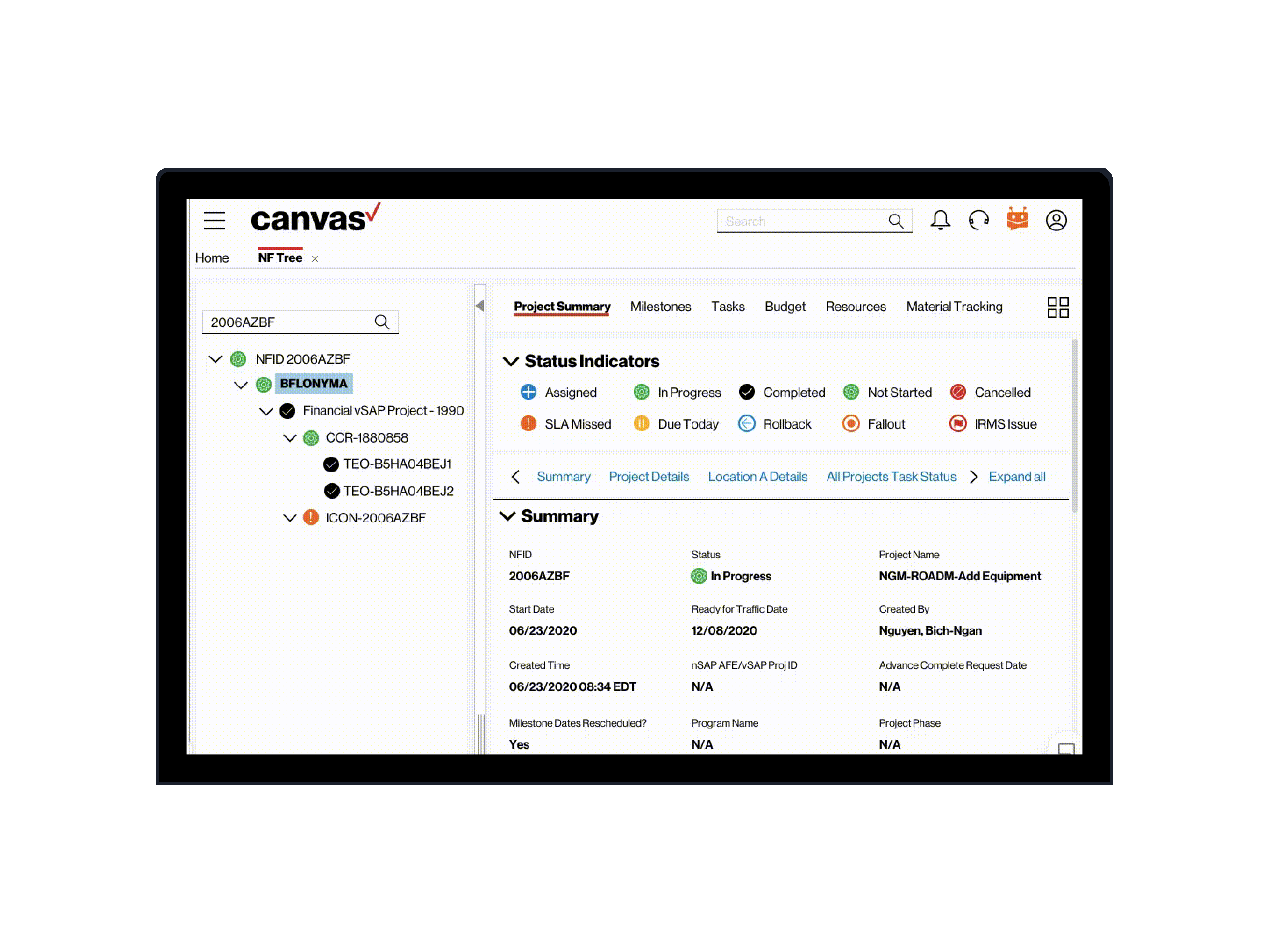
Advanced NFID Search is a tool that we developed at Verizon to help Project Managers and Network Engineers get advanced information associated with an NFID. In addition, this tool allows users to search and find NFIDs based on a multitude of advanced inputs associated with them.
Design Objective
Create a seamless way for users to find an NFID and acquire all information associated with the NFID
Create a seamless way for users to find an NFID and acquire all information associated with the NFID
UX Process
Empathize
User Interviews
We ran several face-to-face user interview sessions with target users - Project Managers and Network Engineers and got a surface-level overview about their current interactions with the legacy system for Advanced NFID search.
Some of the highlights included
Users found it hard to remember NFIDs because of the complex format
Users could recognize NFIDs based on specific inputs associated with each one (like Project Name)
Users wanted more transparency with details associated with each NFID
Users often forgot the input combinations for their previous search
Users felt that typing the same search queries each time was laborious
User Surveys
We sent out a company-wide survey to 50 Verizon employees, primarily Project Managers and Network Engineers across several Networking Projects in the East Coast to understand their current behaviors with the existing legacy system for NFID Search. We had the following questions.
Which input fields do you use the most when locating an NFID?
What data are you looking for after you find an NFID?
What are your reasons for cancelling an NFID?
Which efficiency metric do you want impacted the most through a redesign?
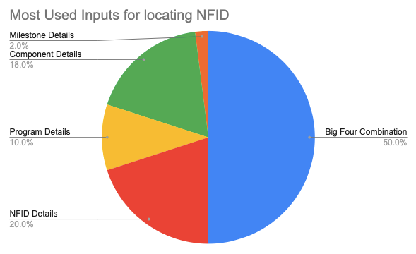
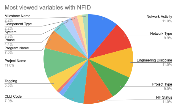
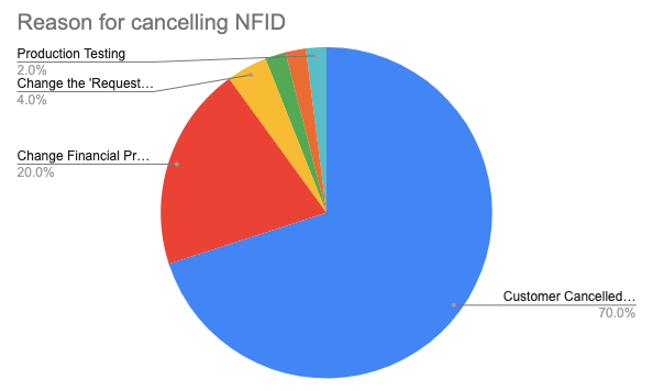
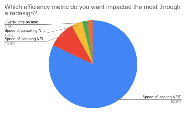
Test
Usability Testing (Legacy System)
Using the data we were able acquire from the user interviews and the user surveys, we ran 7 usability testing sessions with target users - Project Managers and Network Engineers.
Performance Criteria
Once we created the User Task, we defined the criteria for the task based on 5 usability characteristics which include
Memorability - Ability for the users able to remember system processEfficiency - Ability for the users to use the system with efficiency
Learnability - Ability for users to learn the system easily.
Continuity - Seamless experience across all sections
Error Recovery - Ability for the user to easily diagnose and recover from errors with help from the systems
This allowed us to discover pain-points related to each criteria based on our observations and the users verbally articulating their issues.
SUS Calculator
After the testing session, we ran a post-test questionnaire and calculated the average SUS score for all 7 of our participants. The score was tabulated at 54.9 which meant that the existing system was less than usable.
Define
Empathy Map
Based on the data we were able acquire from our research and testing sessions, we created an Empathy map that allowed to understand the user's behaviors.
User Journey Map
We created a User Journey Map by highlighting the user-goal, current experience pain-points, user's emotions, and solutions for entire flow
User Flow
We created an updated user flow to showcase the navigation across the entirety of Advanced NFID Search as per our redesign
Prototype
Design System
We designed this entire platform utilizing the Canvas Design System which is owned by Verizon. All the legacy screens were designed using a system known as UUI 2.0.
We first migrated all the screens from UUI 2.0 to Canvas utilizing their UIKit and Design Guidelines before working on usability optimization.
WCAG Guidelines
Keeping in line with our philosophy of inclusive design, we ensured that we followed all WCAG guidelines for accessibility standards. One of the core issues users faced with the legacy system was depending solely on color coding for system feedback or indicators when they had varying degrees of color blindness. We fixed this problem by including shapes and word
Hi-Fidelity Prototypes
Autocomplete Suggestions
The Search bar that we designed had autocomplete suggestions that focus on the big 4 combinations. This allows users to recognize the combinations from the system's suggestions rather than remember them from memory.
My Last Used v. Frequently Used
The last used big 4 combination of inputs and the most frequently used input combinations are also visible. This allows users to immediately input the big without the need to manually type or recall info.
Advanced Fields
Having access to wide variety of advanced fields builds inclusivity as there are many users who locate NFIDs based on secondary inputs. We also used the survey data to organize the fields based on the ones that are the most in demand. In addition we designed a 'Hide all fields' button to hide all fields and easily bring the table to visibility.
List vs Table View
Users can now trigger between List and Table Views so they can easily see all the information in metadata format without the need for horizontal scrolling
Advanced Settings
We designed this feature to allow users to bring the most used columns to the front as well as lock several ones so cross-referencing columns becomes easy
Cancel NFID
We made it easy for users to cancel the NFID by making the button easily accessible as well as added options based on the survey data in terms of the reasoning behind cancelling NFID s. We also had error messages as notifications clearly visible in accordance with error prevention and recovery
Test
Usability Testing (Redesign)
After the Redesign, we returned to the same users with whom we ran the initial testing sessions with for the legacy systems and mapped out an identical set of tasks with the goal of comparing their feedback and the final SUS score. Some of the feedback included
Search has become so much easier now
This is much easier than the legacy search option
Having these options to help me narrow down search is really good
Having these additional variables with the NFID helps me understand it better
Cancel is so much easier now
I like these cancel options
I really love these two options for the Last Used v. Frequently used options
SUS Score
We ran the a post-test questionnaire with the users for the redesign and tabulated the SUS score which came out at 85.4 which is way about the minimal usability score of 64. We were definitely able to marginally increase the usability of the platform.
Conclusion
This project allowed us to understand the setbacks in search and how search needs to be help users narrow down results with minimal focus on cognitive overland (recall vs. recognition as per Nielson's heuristics). It also allowed us to understand how to expand on building transparency with visibility of additional variables. The process also allowed us to expand on our deliverables, and utilize more diverse set of research methodologies.

